With the world becoming increasingly fast-paced and cluttered, minimalist design is gaining momentum. When it comes to logo design, the rule of thumb is: less is more. Minimalist logo design is all about keeping it simple and focusing only on the essential details.

In this blog, we will explore the power of minimalist design in logo creation, and why it makes sense for businesses to opt for this approach.
Join us as we deep dive into the world of minimalist logo design and its impact on modern branding.
Table of Contents
ToggleWhat is minimalist logo design?
What is minimalist logo design? In today’s world, where everything is so loud and chaotic, minimalism has become a breath of fresh air. Minimalist logo design is all about simplicity. It is a design style that focuses on the essential elements of a logo, stripping it down to its bare minimum and making the design more effective. Minimalist logos feature clean lines, simple shapes, and typography that are stripped of any embellishments.

They are designed to be memorable, impactful and easy to recognize. Minimalism is all about restraint, understatement and taking away all the unnecessary elements to leave only what’s truly important. A minimalist logo design is a reflection of a brand evolving with the times and embracing the less is more philosophy.
The power of simplicity
Logos have been around since the dawn of civilization. They are a visual representation of a brand that leaves a lasting impression on the audience. In today’s world, where attention spans are shorter than ever, less is more in terms of logo design. Minimalist logo design has taken over and for all the right reasons. Here’s why:
The Power of Simplicity
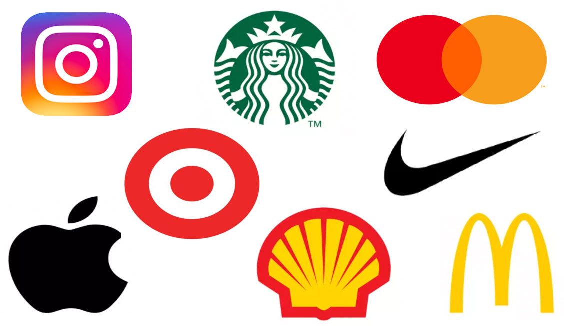
When it comes to a logo, less is more. Minimalist logo designs have a strong impact and are memorable. Think about the iconic swoosh of Nike or the bitten apple of Apple. These logos are simple yet they stick. It’s easy to recognize and recall minimalist logos since there are fewer visual elements to process. This simplicity enables the logo to stand out in a cluttered marketplace. It’s no wonder that many companies are now opting for a minimalist approach when it comes to logo design.

Minimalist Trends in logo design
When it comes to minimalist logo design, there are a few trends that stand out. One of them is the use of negative space, wherein a simple design can convey multiple meanings. Another trend is typography focus, where the font is the main visual element. Geometric shapes and monograms are also popular choices for minimalist logos.
Apart from being impactful and memorable, minimalist logo design offers other advantages as well. It’s flexible and versatile enough to adapt to any marketing material. Minimalist logos are also cost-effective since there are fewer design elements to work with. Minimalist logos stand the test of time since they don’t rely on current design trends. Lastly, they cut through the clutter and make a strong visual impression.

Examples of effective minimalist logos
Minimalist logos have become ubiquitous. Some of the most iconic brands in the world use minimalist logos. Nike, Apple, FedEx, Google, and McDonald’s, to name a few. These logos have stood the test of time and remain memorable years later.

Minimalism is the way to go when it comes to logo design. The power of simplicity cannot be underestimated. Less is more impactful and memorable. It’s easy to recognize and recall, making it stand out in a cluttered marketplace. It is here to stay and for all the right reasons.
Minimalist Trends in logo design
Minimalist trends in logo design have become increasingly popular in recent years. These designs utilize simplicity to create a visually striking logo with a lasting impression. One key element of minimalist logo design is the use of negative space. By incorporating negative space, designers can create a logo that communicates multiple meanings or a hidden message, adding depth to the design.

Another trend is a focus on typography. These logos use typography as the primary design element, allowing for versatility in the logo’s application. This not only creates a unique logo but also a memorable one that stands out to customers. Incorporating geometric shapes is also another trend in minimalist logo design. These shapes create a clean and modern look that can be easily recognizable. Finally, monograms, or initials, have been a popular choice in minimalist logo design due to their simple yet elegant design.

Overall, minimalist logo design offers a cost-effective, flexible, and timeless solution for businesses looking for a modern and visually striking logo. By utilizing negative space, typography, geometric shapes, and monograms, businesses can create a logo that speaks volumes in a visually simple package.
Why use a minimalist logo design?
Let’s face it – creating a logo can be both expensive and time-consuming. But, what if we told you that there’s a design principle that can alleviate both of those issues? By stripping away the bells and whistles, you’re left with a logo that is not only aesthetically pleasing but incredibly practical. Here’s why: Flexibility and versatility – A minimal logo is easily adaptable to various mediums, such as online platforms, business cards, billboards, and even merchandise. It’s not cramped by intricate details or specific colour schemes, providing greater flexibility in its usage. Cost-effective – As previously mentioned, designing a logo can be costly, especially when you consider the revisions and iterations it may go through.
With minimal logo design, you’re keeping the design process straightforward and efficient – saving you both time and money. Stands the test of time – Simplicity is timeless. By eliminating trends and fads from your design, you’re left with an enduring logo that won’t need constant rebranding over the years. Cuts through clutter – Minimal logos have one purpose – to be noticed. In a world where consumers are inundated with visual stimuli, keeping things simple and direct can make all the difference in catching someone’s eye. All in all, the benefits of minimalist logo design speak for themselves.

So, next time you’re considering creating (or refreshing) your logo, consider the impact of less and prepare to reap the rewards in both time and money saved.
Examples of effective minimalist logos
Minimalist logo design has proven to be effective in giving brands a recognizable and memorable identity. Several successful brands have embraced this approach to logo design in recent times. Nike’s ‘swoosh’ is widely recognized and revered as one of the most simplistic and impactful logos in the market. Apple’s half-bitten fruit symbolizes innovation and originality.

The FedEx logo uses negative space to create an arrow, signifying precision and accuracy, while Google’s colourful ‘G’ is now a ubiquitous symbol of the internet giant. McDonald’s iconic golden arches have become synonymous with fast food and are universally recognized. With excellent design and the right message, minimalist logos have the potential to become timeless brand assets.
Wrapping up
In a world where the attention span of consumers is becoming shorter by the day, minimalist logo design proves to be a boon. Its simplicity and brevity cut through the clutter, making brands easily recognizable and recallable. This design trend takes advantage of negative space, typography, geometric shapes, and monograms to create impact. While it may seem like less effort goes into creating a minimalist logo, it requires precise attention to detail.
When executed well, it stands the test of time. Notable examples include Nike, Apple, FedEx, Google, and McDonald’s. A minimalistic approach is cost-effective and flexible.
So, why not give it a try?
What’s Next: Optimizing Website Performance: Faster Loading Strategies

