Introduction
The question How were the logos of different IITs designed? is more than just a curiosity , it reveals how premier Indian technical institutes visually express their identity, values, and mission. Each Indian Institute of Technology (IIT) has a unique logo that blends cultural meaning, academic philosophy, and visual symbolism. In this detailed guide, we explore the design process and meaning behind the logos of several IITs , and why these emblems matter.
What Is the Significance of IIT Logos?
IIT logos are not just graphic symbols , they are carefully designed identities representing:
- Academic excellence and innovation
- Cultural roots and historical context
- Philosophical foundations of knowledge
- Institutional vision and ethos
Understanding how were the logos of different IITs designed helps students, alumni, and enthusiasts appreciate the thought and symbolism embedded in each institute’s visual identity.
How Were the Logos of Different IITs Designed?
1. IIT Bombay – City, Knowledge & Enlightenment

The IIT Bombay logo was designed to reflect the city of Bombay (now Mumbai) and the universal pursuit of knowledge.
- Stylized ‘B’ represents the city’s identity.
- Flame element atop the ‘B’ symbolizes enlightenment and knowledge.
- The Sanskrit motto “Gyanam Paramam Dhyeyam” translates to “Knowledge is the Supreme Goal”, highlighting that academic brilliance is the foundation of IIT Bombay’s mission.
The design was selected to combine locality (Bombay) with a universal visual language of light and knowledge , answering how were the logos of different IITs designed in a way that binds place and philosophy.
2. IIT Kanpur – Enlightenment from Darkness

The IIT Kanpur logo is rooted in the Sanskrit aspirational motto:
“Tamaso mā jyotirgamaya” – Lead us from darkness to light.
This phrase signifies the transition from ignorance to knowledge, which becomes the central theme of the design. The logo represents:
- The journey from ignorance to enlightenment.
- Dedication to intellectual growth and research excellence.
- The institute’s contribution toward societal progress through knowledge.
Here, the design focused on a philosophical statement about life and learning , clearly illustrating how the logos of different IITs are designed to represent core ideals.
3. IIT Roorkee – Purity, Knowledge & Tradition

For IIT Roorkee, the design blends ancient Indian symbolism with technical education.
- Lotus represents purity, wisdom, and association with the goddess of knowledge (Saraswati).
- Open book stands for structured learning and scholarship.
- The Sanskrit motto “Tamaso Ma Jyotirgamaya” connects back to the same ancient ideal of knowledge as a guiding light.
The logo emphasizes both tradition and technical excellence, answering how were the logos of different IITs designed by tying cultural roots with academic vision.
4. IIT Mandi – Freedom in Learning
![]()
The IIT Mandi logo was designed by Dr. Ila Gupta of IIT Roorkee and represents:
- Blue: Infinity, the limitless sky of knowledge.
- Green: Youth, growth, collaboration, and fresh thinking.
- Orange: Energy, dedication, and passion.
The iconography focuses on freedom to explore and the pursuit of excellence, a modern vision that encourages innovation and adaptability. The design answers the question how were the logos of different IITs designed by mixing colors and forms that reflect contemporary values in education.
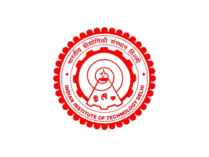
5. IIT Delhi – Architectural & Academic Excellence

While the logo isn’t as symbol-heavy as others, IIT Delhi’s emblem incorporates structural and academic elements that reflect:
- The institute’s architectural identity (e.g., iconic campus structures)
- Interdisciplinary collaboration
- Integration of technology and research
Though not as widely discussed, IIT Delhi’s design emphasizes balance, connectivity, and academic harmony , another creative answer to how were the logos of different IITs designed.
Common Design Themes in IIT Logos
Although each IIT has a distinct logo, several themes emerge from how were the logos of different IITs designed:
- Philosophical Foundations – Most logos use Sanskrit mottos that reflect deep intellectual ideals.
- Cultural Identity – Symbols like the lotus or local references ground the logo in Indian heritage.
- Academic Values – Light, books, and flames represent knowledge, research, and wisdom.
- Visual Simplicity – Despite deep meanings, the designs remain elegant and modern.
- Mission Reflection – Each logo visually communicates what the institute stands for , whether it’s research excellence, innovation, or societal contribution.
Why Logo Designs Matter for IITs
Understanding how were the logos of different IITs designed is more than a design curiosity , it offers insight into:
- Institutional values
- Vision and mission statements
- Cultural and educational priorities
- Brand identity that resonates globally
Final Thoughts
Each IIT logo is a visual narrative. From the enlightenment theme in Kanpur’s emblem to the city identity in Bombay’s design, the answers to how were the logos of different IITs designed show us that there’s thoughtful meaning under every line, color, and motto.
Whether you’re a student, parent, or lifelong learner, appreciating these designs deepens your understanding of what makes IITs not just academic institutions, but cultural and intellectual landmarks.
Also See: Full Explanation Of KVS logo meaning